When we forked PrimeVue, we inherited four themes: Aura, Lara, Material and Nora. They are good themes, and plenty of apps run on them happily. But every time we sat down to build something ourselves, we caught ourselves doing the same thing. Turn the colour down. Make the borders thinner. Shrink the buttons a little. Calm the whole thing down until the interface stopped asking for attention.
After doing that enough times, it felt silly not to ship it. So we did. Nide landed in OpenVue 1.1.0, and it now sits next to the other four as a first-class preset. Nothing changes for apps already using Aura or any other preset. Nide is simply one more option.
Colour that means something
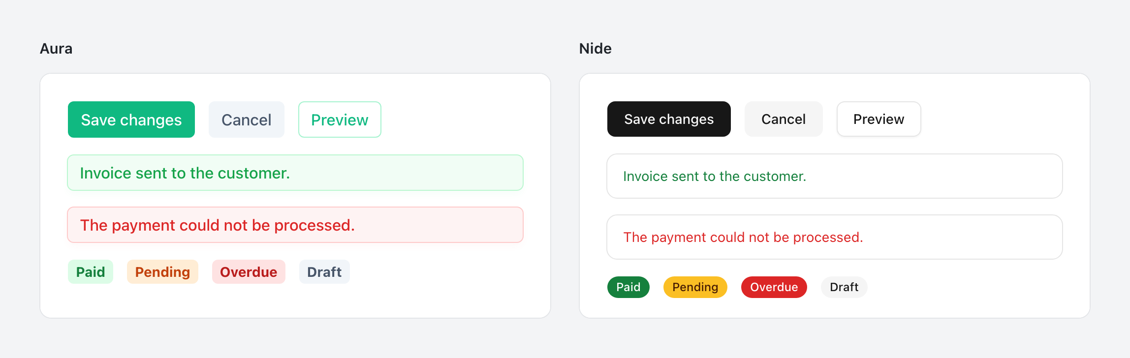
Nide has no brand colour of its own. The primary colour is near-black in light mode and near-white in dark mode, taken straight from the surface palette. Buttons, selected states and toggles all use it.
This is the most important decision in the theme. In most interfaces colour is doing two jobs at once: decorating the components and telling the user something. When every primary button is bright blue, a blue info message has to compete with it, and a red error has to fight for attention against a screen that is already colourful. With a neutral primary, colour is free to carry meaning again. Red means something went wrong, green means it worked, amber means look closer. And when you add your own brand colour, it is the only accent on the page, so it actually stands out.
Structure without noise
Borders in Nide are hairlines, and shadows are soft and kept for things that genuinely float above the page: dropdowns, popovers and dialogs. Everything that sits flat on the page stays flat.
That gives the interface a clear sense of depth. If something has a shadow, it is temporary and on top of everything else. If it has only a thin border, it is part of the layout. Users never have to think about this, but they feel it, and it makes busy screens easier to scan.
Controls that explain themselves
Some components got a different shape, not just different colours.
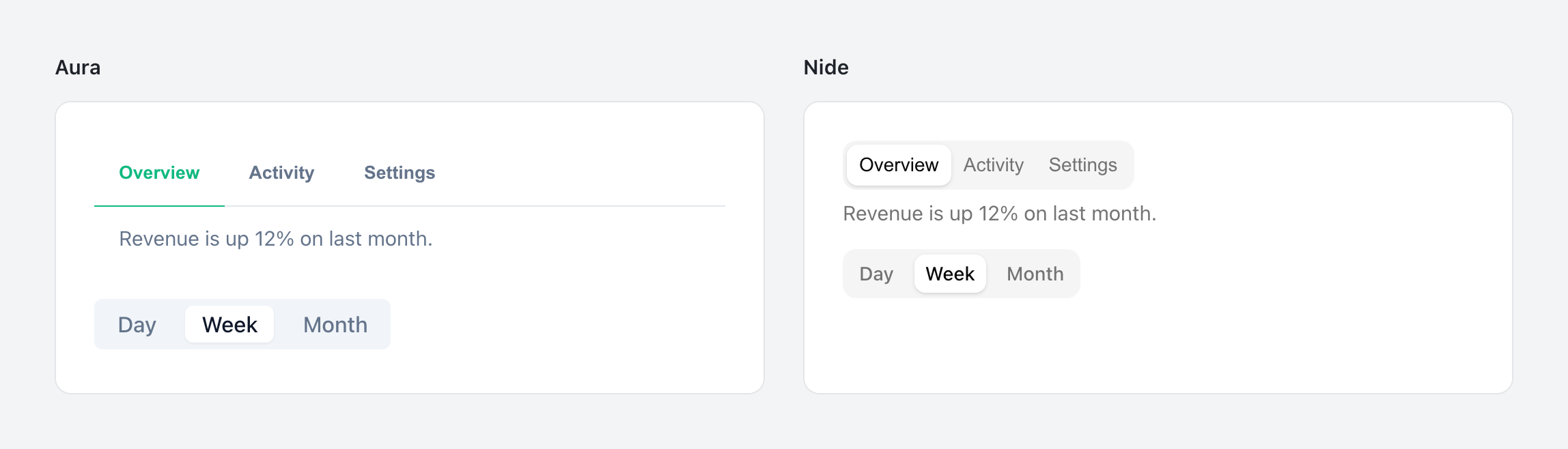
Tabs and SelectButton are segmented: the options sit together inside one container, and the selected one is lifted out of it. A row of separate buttons does not tell you whether you can pick one option or several. A segmented control does, because it looks like a single choice between parts of the same thing.
Built for long sessions
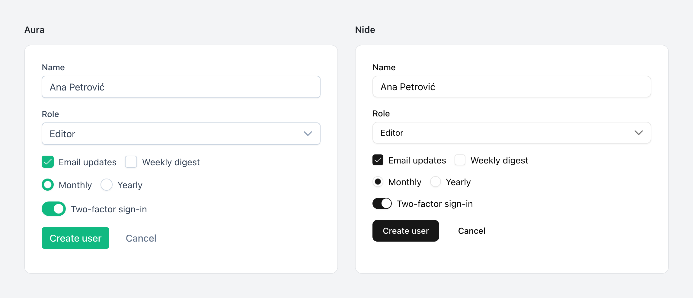
Nide is denser than the other presets. At the default 16px root size, text in buttons and fields is 14px and the controls are 36px tall, with 32px and 40px for the small and large sizes. Checkboxes and radio buttons are 18px, or 16px in the small size.
This is a deliberate choice for the kind of software people spend hours in: dashboards, admin panels, internal tools, anything with a lot of forms and tables. Density there is a feature. More rows fit on screen, related fields stay close together, and the eye travels less between the things that belong together. The controls are still comfortably large enough to hit with a mouse, and if your app needs more room, raising the root font size scales everything with it.
Focus you can see
Keyboard users need to know where they are at all times. Nide uses a 3px focus ring in a muted grey. It is wide enough to spot instantly, even against the near-black primary, but soft enough that it does not flash across the page every time someone tabs through a form.
Motion is kept short as well. Transitions run in 150 milliseconds, which is long enough to show what changed and short enough that the interface never feels like it is waiting for an animation to finish.
Using it
Nide works like any other preset:
import { createApp } from 'vue';
import OpenVue from 'openvue/config';
import Nide from '@openvue/themes/nide';
import App from './App.vue';

const app = createApp(App);

app.use(OpenVue, {
    theme: {
        preset: Nide
    }
});

app.mount('#app');
If you load OpenVue from a CDN, there is a build for that too:
<script src="https://unpkg.com/@openvue/themes/umd/nide.min.js"></script>Under the hood, Nide is layered on Aura's design tokens. Anything you already know about customising Aura carries over: override a token, extend the preset with definePreset, or add a primary colour if you do want a bit of brand after all.
Make it yours
Nide joins Aura, Lara, Material and Nora in both of our theming tools, so you can start from whichever preset fits your project best.
The Theme Builder at openvue.dev/theme lets you pick any of the five as a base and adjust the things people usually want to change: colours, font, corner radius, density, focus ring and a few more. The whole page is the preview, so you see every choice on real components and sample apps as you make it. When you are happy, you export a few small files and drop them into your project.
If you need to go deeper, the Theme Designer lets you edit every token, one by one, on top of any preset you choose.
Both run entirely in your browser. No account, no license key, no paid tier.
What comes next
Nide is the first theme we have designed ourselves, and it will not be the last thing that grows beyond what we started with. Like the rest of OpenVue, it is MIT licensed and free to use however you like.
Try it out, and if something looks off, open an issue. Themes get better the same way components do: someone notices a detail, and we fix it.
Originally published on OpenVue on GitHub .